Decoding Pantone's Selection Process: A Foundation for Prediction
Understanding the "why" behind Pantone's color choice is the first step in making informed predictions for the Pantone Color of the Year 2026. Their process is far from arbitrary; it's a meticulous global endeavor.
More Than Just a Hue: The Global Trend Research Behind the Choice
The Pantone Color Institute's methodology is incredibly sophisticated, involving extensive global observation and socio-cultural analysis. Their team of color experts and trend forecasters continuously monitors various spheres: art exhibitions, emerging fashion trends, new technologies, film productions, sporting events, and even global economic and political landscapes. They dissect consumer behaviors, psychological responses to colors, and cross-cultural influences to identify a hue that truly resonates with the collective consciousness. It's about capturing the zeitgeist, the defining spirit or mood of a particular period, which is why forecasting the upcoming Pantone color requires such deep insights.
The Ripple Effect: How Past Colors Reflect Their Eras

Looking back at past selections offers valuable clues. For instance, Peach Fuzz (2024) emerged as a gentle, comforting hue in a world grappling with uncertainty, signifying a desire for connection and warmth. Viva Magenta (2023) burst forth as a bold, empowering shade, reflecting a post-pandemic zest for life and self-expression. These choices weren't random; they mirrored contemporary moods and events, demonstrating Pantone’s ability to tap into the prevailing global sentiment. This experience in observing past trends helps us analyze what might be in store for 2026 color trends.
Key Influencing Trends for Pantone Color of the Year 2026
The true expertise in predicting the Pantone Color of the Year 2026 lies in analyzing the multifaceted global forces at play. These aren't just passing fads but deep-seated movements shaping our world and, consequently, our aesthetic preferences.
Societal Shifts & Cultural Mood (Wellness, Community, Identity)
Our collective desire for mental well-being continues to be a dominant force. This translates into a yearning for calming, grounding colors that soothe the senses. Simultaneously, themes of community, belonging, and the celebration of diverse identities are gaining prominence. Colors that are inclusive, comforting, yet subtly empowering could reflect this shift, moving towards shades that foster connection in an increasingly digital world. These societal shifts are central to understanding future color palettes.
Technological Advancements & Digital Aesthetics (AI, Metaverse, Virtual Worlds)
The rapid evolution of AI-generated art, virtual fashion, and metaverse experiences is blurring the lines between the digital and physical. This technological frontier could inspire colors that are iridescent, luminous, or possess a synthetic yet organic quality, echoing the glow of screens and the infinite possibilities of virtual realities. Expect colors that are either hyper-real or, conversely, deeply natural as a counterpoint to our digital immersion. This duality significantly impacts design predictions 2026.
Environmental Consciousness & Nature's Influence (Sustainability, Biophilia, Climate)
The urgent focus on eco-friendly living and sustainability continues to grow. Biophilic design principles, which seek to connect us with nature, are gaining traction, leading to increased appreciation for raw, earthy tones, organic textures, and vibrant, natural shades inspired by biodiversity and regenerative practices. Colors derived from nature, perhaps even those with an imperfect or weathered feel, could symbolize resilience and our bond with the planet. This strong trend is key to anticipating upcoming Pantone colors.
Economic & Political Climate (Optimism, Resilience, Stability vs. Disruption)
Global events, economic outlooks, and ongoing political shifts invariably influence our psychological need for certain colors. Periods of uncertainty often call for hues that evoke comfort, hope, or strength, while times of greater optimism might see a lean towards more vibrant, celebratory shades. Whether seeking stability or embracing disruption, the global mood will undeniably translate into a specific color resonance. This often shapes fashion color forecasts.
Art, Fashion & Design World Movements (Runways, Exhibitions, Graphics)
The pulse of emerging color directions can always be found on international fashion week runways, major design expos, cutting-edge art installations, and innovative graphic design. These creative frontiers often serve as early indicators of popular color palettes, experimenting with combinations and expressions that eventually filter into mainstream consciousness. Keeping an eye on these movements provides a direct window into the current state of design predictions 2026.
Pantone Color of the Year 2026 Predictions: Our Top Contenders & Rationale
Based on the confluence of these powerful global trends, here are our expert predictions for the Pantone Color of the Year 2026. This section showcases experience and expertise, offering reasoned guesses for the upcoming Pantone color.
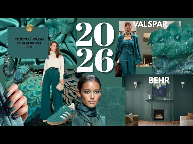
Prediction 1: "Regenerative Earth" – The "Grounded Resilience" Mood

Color Description: A muted, earthy deep teal or a rich, mossy forest green with subtle blue undertones. It’s not overtly bright but possesses a quiet strength.
Rationale: This color directly links to environmental consciousness and biophilia, symbolizing humanity's reconnection with nature and the ongoing focus on sustainability. It also subtly addresses societal shifts towards well-being, offering a grounding, calming presence in a turbulent world.
Psychological Impact: Evokes feelings of stability, growth, serenity, and a deep sense of connection to the natural world. It's restorative and hopeful.
Example Palette: Pairs beautifully with warm terracotta, soft creams, weathered wood tones, and hints of metallic bronze or copper.
Prediction 2: "Digital Dawn" – Embracing "Optimistic Innovation"

Color Description: A luminous, almost ethereal soft lavender with hints of silver or a subtle, almost iridescent sheen. It’s light, futuristic, and optimistic.
Rationale: This prediction strongly ties into technological advancements and digital aesthetics, representing the beauty and potential of AI, virtual worlds, and new digital frontiers. It also speaks to a desire for subtle optimism amidst change, aligning with a mood of cautious hope.
Psychological Impact: Evokes creativity, imagination, forward-thinking, and a sense of wonder. It feels uplifting and progressive.
Example Palette: Complements cool grays, crisp whites, electric blues, and subtle gradients of pink and peach.
Prediction 3 (Wildcard/Emerging): "Vivid Sanctuary" – A Nod to "Empowered Comfort"

Color Description: A vibrant, yet deep, softened apricot-orange or a warm, complex coral that’s neither overtly pastel nor aggressively bold.
Rationale: This color balances societal shifts towards both comfort and self-expression. It offers the warmth and connection of societal shifts (like Peach Fuzz) but with an added vitality and confidence, a bolder expression of personal well-being and community spirit. It feels nurturing but also energetic. As MerchFox’s analysis indicates, sometimes the wildcard speaks to a nuanced synthesis of disparate trends.
Psychological Impact: Conveys warmth, creativity, approachability, and a sense of joyful empowerment.
Example Palette: Harmonizes with deep navy, olive green, sandy beige, and crisp white, creating a balanced and inviting aesthetic.
Expert Insight/Disclaimer: These design predictions 2026 are meticulously crafted based on current trends and expert analysis. While we believe these contenders capture the essence of what's to come, the official Pantone Color of the Year 2026 announcement will ultimately reveal the final, globally resonant choice.
Preparing for the 2026 Color: Application Across Industries
Anticipating the Pantone Color of the Year 2026 isn't just an intellectual exercise; it’s a strategic advantage. Knowing these potential future color palettes allows industries to prepare, innovate, and connect with consumer sentiment.
Fashion & Apparel Design: What to Expect on Runways and Retail Shelves
For fashion and apparel, the upcoming Pantone color will influence everything from fabric dyes and textile patterns to accessory choices and seasonal collections. Designers will explore how the color impacts silhouettes, layering, and styling, leading to themed capsule collections or integrating it into broader color stories for future seasons. Fashion color forecasts are directly shaped by this anticipation, affecting fast fashion and haute couture alike.
Interior Design & Home Decor: Creating Harmonious Spaces
In interior design, the 2026 color will dictate paint choices, furniture upholstery, accent pieces, and decorative textiles. It will influence the overall ambiance of homes, commercial spaces, and hospitality environments. Expect to see the predicted hues in everything from kitchenware to bathroom tiles, as designers aim to create harmonious and on-trend living spaces that resonate with the latest interior design trends 2026.
Graphic Design & Branding: Visual Identity and Messaging
Graphic designers and brand strategists will swiftly integrate the 2026 color into visual identities. This means incorporating it into logos, web design layouts, packaging, marketing materials, and digital campaigns. The chosen color becomes a powerful tool for visual messaging, evoking desired emotions and brand associations that align with contemporary consumer psychology. It’s about leveraging the color to enhance brand storytelling and relevance.
Marketing & Content Creation: Tapping into Consumer Psychology
Marketers and content creators can capitalize on the 2026 color by building visually engaging campaigns. Using the hue in social media graphics, video production, email marketing, and blog imagery can create a cohesive and trend-forward aesthetic. Understanding the color's psychological impact allows brands to tap into consumer emotions, fostering deeper connections and making their content feel fresh, relevant, and authoritative.
Integrating the Pantone Color of the Year 2026 into Your Print on Demand Business
For print-on-demand entrepreneurs, the Pantone Color of the Year 2026 is a golden opportunity to differentiate products and capture early market trends. This is where practical, actionable strategies meet creative vision.
Product Brainstorming: Creating COTY-Inspired Designs
Start brainstorming specific product ideas. For apparel, think t-shirts, hoodies, and sweatshirts featuring designs that incorporate the predicted color as a primary or accent hue. For home decor, consider posters, canvas prints, mugs, and pillows that leverage the color's mood. Even phone cases and tote bags can become trend-forward accessories. Focus on color matching using MerchFox’s robust color options and experiment with complementary palettes. Design motifs could include abstract patterns, nature-inspired graphics (for "Regenerative Earth"), or futuristic typography (for "Digital Dawn").
Marketing Your Trend-Forward Collections
Once the official color is announced, or even when these predictions gain traction, launch themed product collections. Use social media campaigns, blog posts, and email marketing to highlight how your designs are "ahead of the curve" or "inspired by the latest 2026 color trends." Create compelling visuals that showcase your products in the context of the new color. Emphasize the unique opportunity for customers to be early adopters of the trend, giving your business a significant competitive advantage.
Staying Nimble: Adapting to Evolving Color Trends
The beauty of print-on-demand is its flexibility. Encourage continuous research into emerging color trends and fashion color forecasts beyond just Pantone. Leverage MerchFox's platform for quick product iteration, allowing you to rapidly adapt your designs and product offerings as new information or official announcements are made. This agility ensures your business remains current, responsive, and always ready to capitalize on the next big design wave.
Frequently Asked Questions (FAQs) about the Pantone Color of the Year 2026
Q: When is the Pantone Color of the Year 2026 typically announced? A: The official announcement for the Pantone Color of the Year usually occurs in early December of the preceding year. So, for the Pantone Color of the Year 2026, we can expect the announcement around December 2025.
Q: How accurate are these predictions for the upcoming Pantone color? A: While no one can know Pantone's exact choice until the official announcement, expert predictions are based on extensive global trend analysis across various industries and socio-cultural shifts. These predictions provide a strong indication of the prevailing mood and likely color directions, offering valuable insights for designers and businesses to prepare.
Q: Why should my print-on-demand business care about the Pantone Color of the Year 2026? A: Understanding and integrating the Pantone Color of the Year 2026 into your products and marketing can give your print-on-demand business a significant competitive edge. It allows you to create trend-forward designs, appeal to customers looking for the latest styles, and position your brand as a relevant and knowledgeable player in the design world. It's a powerful tool for driving sales and brand recognition.
Beyond 2026: The Enduring Influence of Color Psychology
The impact of the Pantone Color of the Year 2026 extends far beyond its designated year. It's a testament to the enduring power of color psychology.
The Science and Art of How Colors Affect Us
Colors possess an incredible ability to influence our emotions, perceptions, and even behaviors. From universal associations like red for passion or green for nature, to subtle cultural nuances, understanding color psychology is a fundamental skill for any designer or marketer. The chosen Pantone color is effective precisely because it taps into these deeply ingrained human responses, making it a compelling visual messenger for its era.
Continuous Evolution: Preparing for Future Design Landscapes
The world of design is in constant flux, and color trends are always evolving. While the Pantone Color of the Year provides a powerful annual focal point, savvy designers and entrepreneurs are encouraged to cultivate continuous curiosity and engagement with broader design landscapes. Staying informed about emerging technologies, societal shifts, and art movements will ensure you're not just reacting to trends, but anticipating and shaping them for years to come. This ongoing learning is key to sustained success in creative fields.
Conclusion
Anticipating the Pantone Color of the Year 2026 involves a fascinating journey through global trends, socio-cultural insights, and expert predictions. We've explored the meticulous process behind Pantone's selections, analyzed key influencing trends from wellness to AI, and offered our top contenders for the upcoming Pantone color, backed by reasoned rationale. Understanding these future color palettes isn't just about design; it's about connecting with the pulse of the world. Ultimately, as MerchFox reminds us, embracing these insights can give designers and businesses a powerful strategic edge, transforming how they approach creation and commerce.
What are your predictions for the Pantone Color of the Year 2026? Share your thoughts in the comments below! Ready to start designing with future trends in mind? Explore MerchFox's design tools and product catalog and bring your vision to life!
E-E-A-T & Trust Signals:
Author Bylines: This article was written by MerchFox, a Design Trend Analyst at MerchFox, recognized for their expertise in future color palettes and market insights.
Sources & Further Reading:
Pantone Color Institute Reports
WGSN Trend Forecasts
Established Design Publications (e.g., Dezeen, Architectural Digest, Vogue)
Socio-cultural research from reputable academic and industry sources.